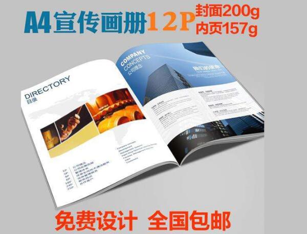
現在很多企業為了方便企業的選擇,都會選擇彩色印刷印刷,為什么會選擇彩色印刷呢。
Now many enterprises choose color printing for the convenience of their choice. Why do they choose color printing.
現在的彩色印刷是利用平版印刷,在印版上涂上彩色材料的油墨,通過印版裝置即可進行印刷。當印刷時,只有油墨友好部分的圖像被轉移到紙上,形成印痕。平版印刷、平版印刷和膠印是平版印刷。它是基于“油和水不混合”的原則來實現印刷的。彩色印刷印刷快捷方便,而且是一種很好的審美,是做很多宣傳的選擇。
The current color printing is to use lithography. The printing plate is coated with the ink of color materials, which can be printed through the plate device. When printing, only the image of the ink friendly part is transferred to the paper to form the impression. Lithography, lithography and offset are lithography. It is based on the principle of "oil and water do not mix" to achieve printing. Color printing is fast and convenient, and it is a good aesthetic, and it is a choice to do a lot of publicity.
1. 如果彩色地圖需要大面積純黑色背景,建議使用K:100, C:30。這樣的黑色印花比同色的黑色更鮮亮。當然這個數字不是固定的,我曾經做過一個對開的海報,用的是K:100, C:80,這是因為面積太大,印刷機速度快,很難使顏色立體,所以數值也相應增加了。此外,如果有一個暖色模式對整個畫面有羽毛的邊緣,或有一個溫暖的基調透明度,然后根據實際值調整主要溫暖的色調,如K: 100年,M: 60, Y: 70年,過渡模式是非常舒適的一部分,不像K奇怪:100。你可以在PHOTOSHOP中看到。
1. if the color map needs a large area of pure black background, it is recommended to use K:100 and C:30. This black print is brighter than that of the same color. Of course, this number is not fixed. I used to make a split poster with k:100 and c:80. This is because the area is too large and the printing machine is fast, so it is difficult to make the color three-dimensional, so the number has increased accordingly. In addition, if there is a warm color mode with feathers on the edge of the whole picture, or a warm tone transparency, and then adjust the main warm colors according to the actual values, such as K: 100, M: 60, Y: 70, the transition mode is a very comfortable part, unlike K strange: 100. You can see it in Photoshop.
2. 反白字或反白細線的混色圖案。在選擇字體(或英鎊的行數),注意不要使用歌曲的風格,薄圓等等太細的字體,嘗試使用粗體、隸書和其他明顯的字體,設置的版本是不允許的,文本或線看不見。
2. Mixed color pattern of anti white characters or anti white thin lines. In selecting font (or the number of lines in pounds), pay attention not to use the style of songs, thin circles and other fonts too thin, try to use bold, official script and other obvious fonts, the version set is not allowed, and the text or line can not be seen.
3、濟南印刷廠做小標簽,如需要卷盒、打孔之類的東西,注意,盡量不要設計外框。因為,如果鋼板在滾動箱中的位置稍有偏差,就會出現一邊小的情況。
3. Jinan printing factory makes small labels. If you need to roll boxes, punch holes and other things, please pay attention not to design the outer frame as much as possible. Because, if the position of the steel plate in the rolling box slightly deviates, there will be a small situation on one side.
4雜志、報紙、膠紙印刷設計應注意,新聞紙和磁帶都吃,所以,除了電影注意網格數,還要注意,在生產的時候減少相應的色度,如報紙,你需要看到灰色30級,所以當我設置灰度24左右,等等的一些灰新聞紙,實際效果相當于30灰度。(雙)膠紙比新聞紙白,調整色度可低于普通銅版印刷,高于報紙草稿,具體感受和感受。
4. Attention should be paid to the printing design of magazines, newspapers and offset papers. Both newsprint and tapes should be eaten. Therefore, in addition to the number of grids in films, attention should be paid to reducing the corresponding chromaticity during production. For example, newspapers, you need to see gray level 30. So when I set gray level 24 or so, the actual effect of some gray newsprint is equivalent to 30 gray level. (double) the offset paper is whiter than the newsprint, and the adjustment color can be lower than that of the ordinary copper plate printing and higher than that of the draft of the newspaper.
以上是濟南印刷廠為大家介紹的相關內容,想要了解更多內容,歡迎訪問網站:http://www.seven2000.com/The above is the relevant content introduced by Jinan printing factory. To learn more, please visit the website: http://www.jingyinshua.com/
