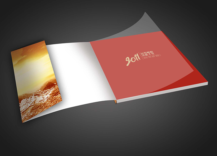
如今的濟南臺歷掛歷印刷不僅是作為生活工具也在向家居裝飾方面發(fā)展,其精美的制作完全超過了它的使用功能。然而,一份精美的臺歷掛歷的制作完成也是不易的,需要具備設計創(chuàng)意和設計細節(jié)的處理,如設計完成后的印刷工作,它是關乎到掛歷是否精美、細致的關鍵要素。
Today's Jinan calendar printing is not only as a living tool, but also to the development of home decoration, its exquisite production completely exceeds its use function. However, it is not easy to make an exquisite calendar, which requires creative design and detailed design. For example, the printing work after the design is completed is a key element related to whether the calendar is exquisite and meticulous.
一份的臺歷掛歷的形成需要在印刷上下足功夫,需要注意印刷設計中的圖片、字體、色彩、輸出附件和檢驗等五個方面。濟南臺歷掛歷印刷
In addition, we need to pay attention to five aspects of printing calendar, such as printing, printing and printing. Jinan calendar printing
一、臺歷掛歷印刷的圖片問題
1、 Picture problems in calendar printing
①關于psd文件,有一點需要注意,就是你導入它后不要再做任何“破壞性*作”。比如:旋轉,鏡像,傾斜等。由于它的透明蒙版的關系,輸出后產生破碎圖。
① One thing to note about PSD files is that you should not do any "destructive * work" after importing them. For example: rotation, mirror image, tilt, etc. Because of its transparent mask, the output produces a broken map.

②還是蒙版,在coreldraw中使用也要小心些,必要時候還不如采取“置入容器”方法比較保險。
② It's better to use the mask in CorelDRAW. If necessary, it's better to take the "put in container" method.
③分辨率和重新取樣。不要在corel中做這個,“轉換為位圖”的確方便,但損失的是色彩還原,要點在ps中做好拿來。
③ Resolution and resampling. Don't do this in Corel. "Convert to bitmap" is really convenient, but the loss is color restoration. The main point is to do it in PS.
④所有圖片必須是cmyk或者灰度和單色bitmap圖。否則不能輸出。
④ All images must be CMYK or grayscale and monochrome bitmap images. Otherwise, it cannot be output.
二、色彩的漸變問題
2、 Color gradient
①常見的問題是這樣:如紅色→黑色的漸變,設置錯誤:(M100→K100)中間會很難看。正確的設置應該是這樣:(M100→M100K100)仔細分析下就明白了,其他情況類推。
① The common problem is as follows: for example, if the gradient is red to black, the setting is wrong: (M100 → k100), and it will be hard to see in the middle. The correct setting should be as follows: (M100 → m100k100) after careful analysis, it will be clear that other situations are similar.
②透明漸變是適用于網絡圖形的辦法,灰度圖也可,但完稿輸出不能用,因為空間混合模式為RGB,屏幕混合色彩同印刷CMYK差異太大。切切注意。
② Transparent gradient is suitable for network graphics, grayscale image is also OK, but finished output cannot be used, because the spatial blending mode is RGB, the screen mixed color is too different from the printing CMYK. Be careful.
③黑色部分的漸變不要太低,如5%黑色,由于輸出時有黑色疊印選項,低于10%的黑色通常使用的替代而不是疊印,導致出問題,同樣,使用純淺色黑也要小心。
③ The gradient of the black part should not be too low, such as 5% black. Because there is a black overprint option in the output, the black below 10% is usually replaced instead of overprint, resulting in problems. Similarly, be careful when using pure light black.
三、字體方面的問題
3、 Font problems
①某些字體庫描述方法不同,筆畫交疊部分輸出后會出透疊。
① Some font library description methods are different, stroke overlap part of the output will be out of permutation.
②包含中英文特殊字符的段落文本容易出問題
② Paragraph text containing special Chinese and English characters is prone to problems
