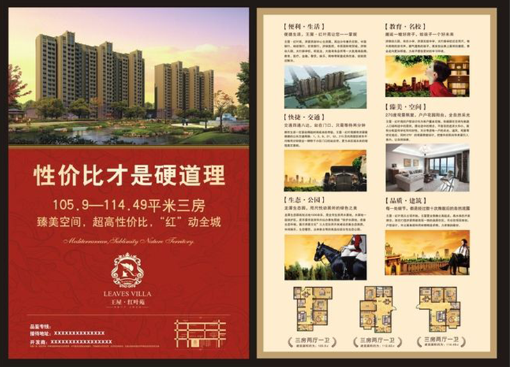
畫冊的設計和制作,相比于書籍來說沒那么復雜。畢竟從目的性來看,畫冊的商業性比書籍的強。所以畫冊的主要作用在于宣傳、產品,它會隨著、產品的更新而更改畫冊內容。
The design and production of picture books are less complicated than books. After all, from the perspective of purpose, the commercial nature of picture books is stronger than that of books. Therefore, the main function of the album is to publicize the brand and products. It will change the contents of the album with the updating of the brand and products.
而裝訂方式基本是以平裝方式去制作,畢竟印刷成本低,甲方的接受度也較高。當然也會有舍得花錢的甲方去定制更精美高檔的畫冊。下面我們來看看,設計一本畫冊主要需要哪些頁面內容組成。相信下面的總結對于沒接觸過畫冊設計的小伙伴非常友好,喜歡的話記得轉發分享哦!
And the binding method is basically made in paperback. After all, the printing cost is low, and the acceptance of Party A is also high. Of course, there will also be Party A who is willing to spend money to customize more exquisite and high-end picture books. Now let's take a look at what page content is needed to design an album. I believe the following summary is very friendly for those who have not been in touch with album design. If you like, please remember to forward and share!
01#封面封底
01 front and back cover
是封面和封底,封面主要放置畫冊的名稱、logo和企業公司名,而封底一般是聯系方式,這也是大部分企業需要展示的信息。
The first is the front cover and the back cover. The front cover mainly includes the name of the album, the brand logo and the company name, while the back cover is generally the contact information, which is also the information most enterprises need to display.
02#環襯頁
02 ring lining
然后是環襯頁,環襯頁一般放置logo,又或者是slogan,甚是企業簡介、目錄的文案內容。
Then there is the ring lining page. The ring lining page generally places the logo, slogan, or even the copy content of the company profile and directory.
03#扉頁
03 title page
接著是扉頁,扉頁會放一些領導或者企業的寄語、就像前言一樣。當然也有畫冊是不需要前言的,直接就是進入目錄頁或內容頁。
Then there is the title page, which will put some messages from leaders or enterprises, just like the preface. Of course, there are also albums that do not need a foreword, but directly go to the contents page or the contents page.
04#目錄頁
04 contents page
目錄頁能起到檢索畫冊的功能,一般以簡潔版式為主。但并不是所有畫冊都需要目錄,如果內容較多,就需要目錄來幫助翻閱畫冊。關于目錄頁的版式,會有這幾種樣式參考。
Directory page can play the function of retrieving picture books, and is generally based on concise layout. However, not all picture albums need a catalog. If there is more content, you need a catalog to help you look through the picture albums. About the layout of the table of contents page, there are several styles for reference.

★ 常規排列:
Conventional arrangement:
目錄設計不能過于花俏,通過分欄依次將目錄信息排列,需要注意信息的邏輯和主次關系,還有留白的運用。這種常規的布局也是更常見的目錄做法。
Directory design should not be too fancy, through the column will be directory information in turn, we need to pay attention to the logic of information and primary and secondary relations, as well as the use of white space. This conventional layout is also the most common directory approach.
★ 放大數字:
Digital amplification:
如果想要版面更加靈活,我們可以從頁碼數字進行設計,以放大數字或加粗的對比形式來區分信息,提高畫面的跳躍率和層次感。
If we want to make the layout more flexible, we can design from the page numbers to distinguish information in the form of enlarged numbers or bold contrast, so as to improve the jump rate and level sense of the picture.
★ 運用色塊:
Use color block:
又或者結合色塊,形成面。色塊不但有填充版面空洞問題,還有區分突出的作用。
Or combined with color block to form surface. Color block can not only fill the holes in the layout, but also distinguish the prominent role.
★ 線的使用:
Use of cable:
“線”在版式中的作用主要表現為:表示強調、明確分隔、視覺引導和豐富畫面等。從某種意義上來說版式設計就是點線面的游戲,適當添加線條,不但讓版面不再單調,反而具有活力和時尚感,讓你的設計更加分。在畫面中使用線,既有功能性又有審美性,但是不要為了加線而給版面畫蛇添足。
The main functions of "line" in layout are: emphasis, clear separation, visual guidance and rich pictures. In a sense, layout design is a game of points, lines and surfaces. Adding lines appropriately will not only make the layout no longer monotonous, but also make it energetic and fashionable, which will make your design more valuable. The use of line in the screen, both functional and aesthetic, but do not add lines to the layout.
05#章節頁
Chapter page
如果一本畫冊包含很多個欄目,內容比較多,就需要通過章節頁區分不同欄目內容,這樣更方便閱讀,提高信息的傳達度。
If a picture album contains many columns with more content, we need to distinguish the contents of different columns through chapter pages, which is more convenient to read and improve the communication degree of information.
所以章節頁可以使用顏色來區分內容,例如單色或漸變色,再結合序號、章節的標題簡介,又或者是具有代表性的,甚可以嘗試創建一個有吸引力的字體或圖形,也能給章節頁帶來全新的視覺效果,少給客戶的感覺是有經過思考和設計過的。
So the chapter page can use color to distinguish content, such as monochrome or gradient color, combined with serial number, chapter title introduction, or representative, or even try to create an attractive font or graphics, can also bring a new visual effect to the chapter page, at least give customers the feeling of thinking and design.
06#內容頁
06 content page
那么內容頁的編排,也要考慮信息量的多少,信息多的情況下,可以借助網格劃分信息的區域,適當留一下白;信息少需要就利用圖像圖形,或者色塊來提升版面率和圖版率,盡量讓單調的畫面更靈活。
Then the layout of the content page should also consider the amount of information. In the case of more information, you can use the grid to divide the information area and leave some white space appropriately; Less information needs to use images, graphics, or color blocks to improve the layout rate and plate rate, try to make the monotonous picture more flexible.
If you have more knowledge to share with us, welcome to leave a message on the website: Jinan album printing http://www.seven2000.com
